-
solutinos

-
Hire
 Frontend Developer
 Backend Developer
-
 NodeJS Developer
-
 Java Developer
-
 Django Developer
-
 Spring Boot Developer
-
 Python Developer
-
 Golang Developer
-
 Ruby on Rails Developer
-
 Laravel Developer
-
 .NET Developer
 Technology
-
 Flutter Developer
-
 React Native Developer
-
 Xamarin Developer
-
 Kotlin Developer
-
 Cross-Platform Developer
-
 Swift Developer
-
 MongoDB Developer
-
.svg) C Developer
C Developer
-
 Smart Contract Developers
 Cloud
Cloud
-
-
Services
Mobile Development
 Web Development
- Work
-
Multi Services App
-
 Food Delivery App
-
 Grocery Delivery App
-
 Taxi Cab Booking App
-
 Multi Services App
-
 OTT Platform APP
-
 Social Media APP
-
 Freelance Service App
-
 Car Rental App
-
 Medicine Delivery App
-
 Liquor Delivery App
-
 Sports Betting App
-
 Online Coupon App
-
 eLearning App
-
 Logistics & Transportation App
-
 Courier Delivery App
-
 On-Demand Real Estate App
-
 E-Wallet APP
-
 Online Dating App
-
 Handyman Services App
-
-
Process
-
Company
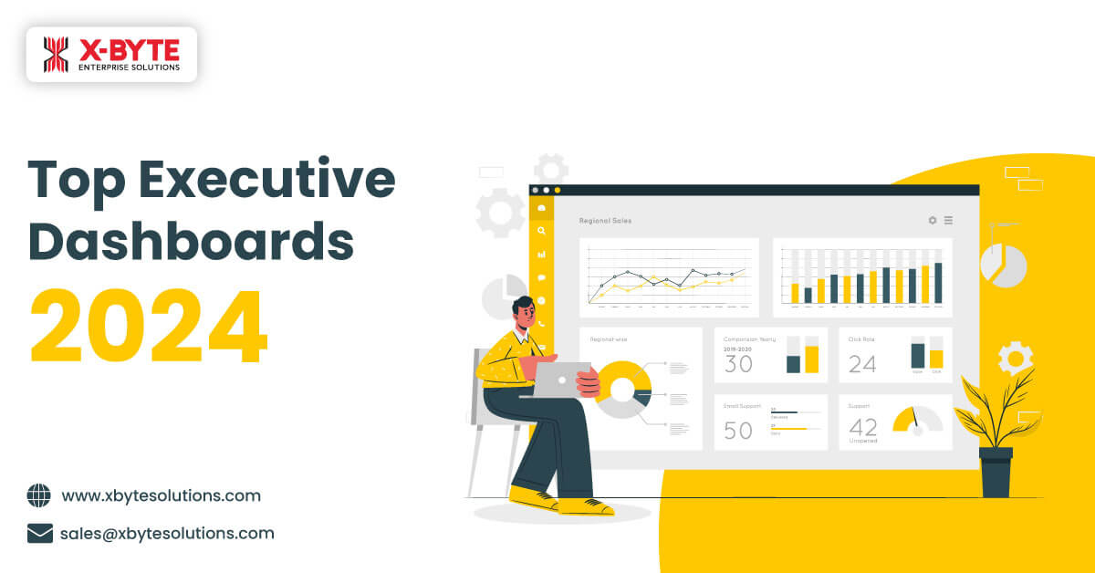
Quick Summary : In 2024, executive dashboards have become essential tools that present complex information into actionable insights for strategic decision-making across various sectors. Executive dashboards consolidate data into an easily comprehensible layout. This helps frontline managers in decoding complex metrics and correlations. The post details the types and benefits of executive dashboards.
Business intelligence derives its roots from data collection, data analysis, and powerful presentation. A sophisticated and advanced business intelligence is largely dependent on two factors; how data is collected and how it is presented. How data is collected decides the quality of the data whereas how well data is presented decides the value of the insights that business managers gain from the collected data. While data scientists and quants are trained to extract key findings, patterns, and trends from data sets, it is not easy for executives and business managers to do the same.
This is where visualization tools like executive dashboards come to their rescue. Rather than processing data from tedious reports, and tables, managers can use executive dashboards that present the key analytics and metrics in an easily understandable visual representation.
With executive dashboards, managerial-level professionals can easily make sense of the data due to interactive visualization. This increases their speed to make strategic decisions and decreases their response time to adapt to changing marketplaces. This swiftness in accessing and interpreting key metrics can make the difference between growth and stagnation.
The article lists the top executive dashboard types that are used by managers to decipher complex data into actionable insights.
What is an Executive Dashboard and How Does it Work?
An Executive Dashboard is a visual representation tool that provides senior executives and business managers with a quick and easy way to view key performance indicators (KPIs) related to their domain.
Executive business dashboards are designed for problem-solving. For instance, if a customer relationship manager aims to reduce customer churn, the executive dashboard is expected to present metrics like current and historical customer churn rate, customer satisfaction score, and engagement rate in a measurable format. Measurable metrics eliminate subjectivity and bring actionable insights that are devoid of ambiguity.
Most data is noise. The objective behind an executive dashboard is to cut through the noise and provide specifics. It cuts the data overload to provide key metrics that will help businesses make data-driven decisions.
Another element of the executive dashboard is the information design. Intuitive and AI-powered dashboards will present information in a way that makes it most easily understandable. It is like deciding whether a particular data can be more explicitly presented in a bar graph or pie chart. Or whether a heat map is more appropriate to show a data insight or a tree map?
By 2025, the world will consume and store 180+ Zettabytes of data. Interestingly, the sheer volume of data itself presents a challenge for any business looking to capitalize on data-driven analytics. Going forward, it will be difficult for any business to do without visual presentation,
Executive Dashboards provide frontline managers and key personnel in any organization the power to clearly view and interpret complex and voluminous data unobtrusively. In modern organizational setups, their role extends beyond mere data visualization and these dashboards are more like a personal assistant for managers.

Connect with us to create custom executive dashboards for your organization.
Connect With Us Connect With UsExecutive Dashboards Work by Combining Narrative Technique with Data Visualization
“Humans have told stories since the Cro-Magnon era to communicate with others for survival and record accounts of daily life,” states an article published by Harvard.
Executive dashboards combine narrative techniques with data visualization to transform raw data into a compelling story. Imagine a ship on a voyage across the ocean. In unknown ocean territories, the captain needs to make informed decisions to ensure a safe and efficient journey. The ship’s navigation system (dashboard) provides essential information through various instruments and maps (data visualization). Similarly, executives requiring crucial information depend on dashboards like the captain.
A picture tells a thousand words’ said F. R. Barnard. A picture can tell a story without using words. Executive dashboards are the storytellers of the business world. They take heaps of raw data and turn it into a compelling story.
Here's the magic part: they use charts, graphs, and indicators much like illustrations in a storybook, making complex information easy to understand at a glance. So, in essence, executive dashboards turn the potentially mundane task of going through data into an engaging narrative, helping leaders make informed decisions with confidence.
Executive Dashboards For Frontline Managers
Sales Dashboards
These dashboards provide sales managers, and sales teams with real-time insights on current sales pipelines, sales targets, sales competition, product demos, and an overview of sales activities (calls, emails, messages). A sales dashboard is an interactive visualization tool that shows everything from how sales teams are performing to how much sales a business does in a year, quarter, month, week, or day. Having a sales dashboard is super helpful because it puts all this information in one place in a way that's easy to understand. With a quick glance sales teams can get the complete picture of their sales activities and sales analytics and act accordingly for improvement.
Who Can Use:Sales Managers, Sales Team leaders, Sales Executive
KPIs Measured:- Sales revenue
- Revenue per salesperson
- Sales by Quarter/Week/Day
- Customer acquisition cost (CAC)
- Win rate
- Lose rate
- Conversion rates
- Referrals
- Sales opportunities
- Sales forecasts
- Up-sell/cross-sell rate
HR Dashboard
An HR dashboard acts as a pivotal resource for HR teams, offering insights and oversight on important HR metrics. Think of it as the control center for all hiring activities. This platform enables HR professionals to monitor various aspects—from the number of applicants eager to join the firm, down to those navigating through the recruitment process. Using an HR dashboard, HR teams can quickly find helpful information for hiring better, managing the workplace more effectively, and helping employees perform their best. It's like having a handy tool that helps HR folks make smart hiring decisions, keep everything organized at work, and support employees in doing great work.
Who can use:HR Manager, Hiring Manager, Recruitment team
KPIs measured:- Absenteeism rate
- Overtime Hours
- Training Costs
- Salary Cost By Department
- Salary Cost By Country
- Workforce diversity report
- Employee Productivity
- Talent Satisfaction
- Manager Feedback Score
- Cost per Hire
- Recruiting Conversion Rate
- Time to Fill
- Headcount Fluctuation report
Operations Dashboard
An operational dashboard is a crucial tool in business management that helps monitor the performance of various business operations within a specific area. Operational dashboards are designed to provide real-time insights into ongoing activities while allowing organizations to identify patterns and potential issues that may affect performance. By using visual data representation that is both clear and concise, these operational dashboards can promptly allow managers to evaluate the condition of their operations and take corrective actions where essential.
Who can use it:Managers, IT directors, Operations directors, Team leaders
KPIs measured:- Gross Profit Margin
- Operating Cash Flow
- First contact resolution (FCR)
- Customer satisfaction
- Capacity Utilization
- Employee satisfaction
- Demand forecasting
- Machine Downtime Rate
- Order Rate
- Inventory Carrying Costs
SEO Dashboards
An SEO dashboard shows the most prominent information needed to track marketing performance and achieve goals. These boards help bring together key marketing metrics in one place and make it more convenient to see how campaigns are performing with a quick look. By monitoring key metrics like conversion rates, customer acquisition costs, and return on investment, businesses using these dashboards can ensure they are on track to meet their goals and objectives
Who can use:Marketing manager, Digital manager, Social media manager
KPIs measured:- SEO Traffic
- Engagement rate
- Reach and impressions
- Click-through rate (CTR)
- Pay-per-click (PPC)
- Conversion rate
- Return on marketing investment (ROI)
Financial Dashboard
A financial dashboard is a management tool that helps track all your relevant finance KPIs, allows for effective cash management, and enables you to track expenses, sales, and profits in detail to meet and outperform a department's or company's financial objectives. By using financial dashboards, a business can easily understand and measure all the data accurately, and in real-time. They enable finance experts to validate figures faster and drill into financial details as much as needed, increasing productivity and, ultimately, providing a stable financial environment.
Who uses it:Accounts Manager, Finance team, CFO, CEO, Finance director
KPIs measured:- Gross Profit Margin
- Operating Profit Margin
- Operating Expense Ratio
- Variable Operating Expenses
- Operating Expenses Development
- Net Profit Margin
- Working Capital
- Current Ratio
- Quick Ratio / Acid Test
- Berry Ratio: Cash Conversion Cycle
- Accounts Payable Turnover
- Accounts Receivable Turnover
Business Analytics and Reporting Dashboards
A business analytics and reporting dashboard is a tool that helps understand and see information about how well a business is doing. This ingenious tool gathers bits from various sectors - sales numbers, ad success, cash flow, daily ops, and customer feedback. In doing so; it offers a full view of the organization's performance. Firms rely on these dashboards to keep tabs on their journey towards goals set forth. They spot trends and directions while aiming at objectives.
Who can use it:Executives, Department heads, Analysts
KPIs measured:- Total Revenue
- Sales growth
- Average order value
- Gross profit margin
- Net Profit
- Cash flow
- ROI
- Customer satisfaction score
- Customer acquisition cost (CAC)
- Customer lifetime value (CLV)
Project Management Dashboards
A project management dashboard acts as a central hub, displaying key metrics and insights tailored to a specific project. It offers a comprehensive overview of performance indicators, aiding teams in tracking progress, identifying trends, and contributing to informed decision-making. This tool is really helpful for departments to make their projects successful and make smart choices for the organization.
Who can use it:Project manager, CIO
KPIs measured:- Projects Delivered on Budget
- Average Handle Time
- Accuracy Estimates
- Cost-per-Acquisition (CPA)
- Total revenue & costs
- Timesheet Summary
- Cost per Conversion
- Budget Attainment
- Reopened Tickets
SaaS Management Dashboard
A SaaS dashboard organizes key SaaS metrics like recurring revenue, CLTV, lifetime customer value, ARPU, CAC, etc into an easy-to-navigate shareable screen. Using historical and real-time data, executives can deep dive into performance trends of SaaS applications, share key ideas within the organization, and make data-driven decisions to boost their profitability. This dashboard identifies the strengths and weaknesses of your business and provides vital insights for its benefit. Simply put a SaaS metrics dashboard serves as a useful tool that helps you craft powerful strategies through data visualization, improving your Saas business's efficiency.
Who can use it?Executives and Senior-level Executives
KPIs Measured:- SaaS Financial Metrics
- Customer lifetime value (CLV)
- The average revenue per unit (ARPU)
- Monthly recurring revenue (MRR)
- Revenue Churn
- SaaS Product Metrics
- Feature adoption
- SaaS Customer Metrics
- Customer Churn Rate
- SaaS Sales Metrics
- Sales qualified leads (SQL)
- Average selling price (ASP)
- Customer acquisition costs (CAC)
- SaaS Marketing Metrics
- Lead velocity rate (LVR)
- Marketing qualified lead (MQL)
- Net Promoter Score
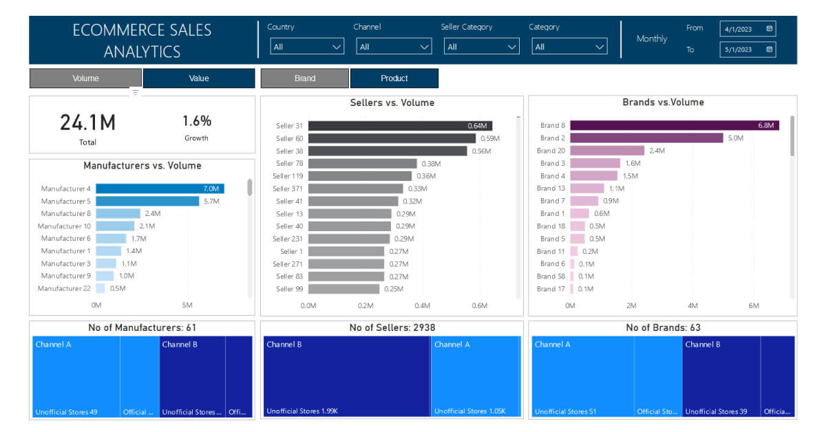
E-commerce Dashboard
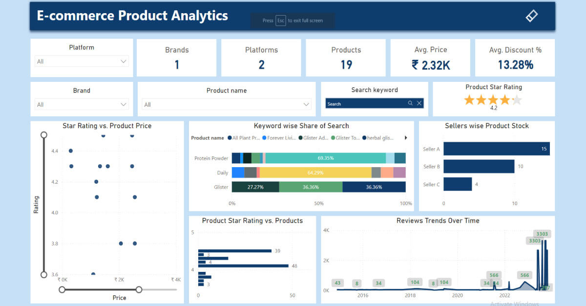
An e-commerce dashboard is an E-commerce analytics tool that gathers data from various touchpoints and shows it in the form of core business KPIs. It monitors metrics like sales, web traffic, social media, and customer behavior and provides a bird's eye view of your ecommerce growth and success. Think of it like a control panel for your online business. By showing key metrics in one place, it makes it easier to keep an eye on business vitals.
By spotting trends and finding chances to do better, this ecommerce management dashboard helps you use data to make better choices to reach your business goal. In short, an e-commerce dashboard is a must-have tool for your online store. It helps you track the health of your business, suggest ways to improve key metrics, and use real-time info to help you outperform your competition.
Who can use it?Business owner, Marketing Director, CEO
KPI Measured:- Revenues
- Gross sales
- Number of orders
- Lifetime value (LTV)
- Profit Margins
- Number of items in stock
- Top selling products
- Average order value
- ROAS
- Top Customers and Segments
- Refunds
- Return on ad spend
- Top Channels
Real Estate Dashboard
If you work in real estate, you deal with tons of information every day. With several KPIs to follow, real estate management can be overwhelming sometimes. This is where a dashboard comes to your aid. It analyzes large chunks of real-estate data and translates it into a meaningful and understandable format. It tracks important real estate metrics like the number of calls and visits, new leads, deals closed, rentals, commissions, and how long properties sit on the market. It lets you see all your important info in real time. A real estate management dashboard also comes in handy in monitoring monthly or weekly sales trends, tracking profits, and keeping an eye on your team's performance.
Who can use it:Realtors, Real Estate agencies
KPI Measured:- Total properties for sale
- Total properties for rent
- Sales by area
- Sales vs. Target
- Revenue trends
- Average number of visits
- Total sales
- Total rent
- Top closers by sales
- Calls vs. meetings
- Hot Leads
- Leads Source
Boost business operations with enhanced executive dashboards customized based on specific requirements.
Healthcare Dashboard
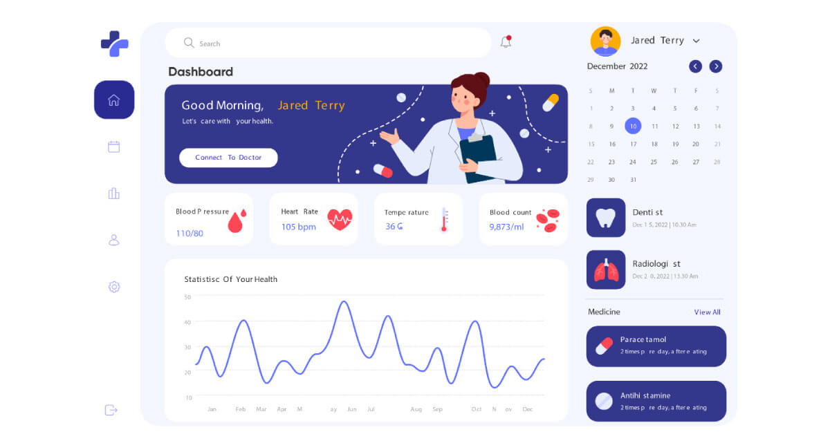
A healthcare dashboard is a modern-age tool to monitor a healthcare facility’s KPIs. It enables healthcare professionals to check how their facility is doing. It analyzes important healthcare metrics like hospital performance, no. of patients, expenses, staff attendance, patient satisfaction, and many more with ease.
Healthcare analytics help you to run your facility smoothly and monitor the KPIs of different divisions in one place in the form of various dashboards. For example, a Hospital KPI Dashboard tracks major KPIs like no. of patients admitted, Avg. treatment costs, available staff, patients by division, etc while the metrics of a Patient Satisfaction Dashboard (Average wait time, patient falls, satisfaction rating) show you the picture of satisfaction levels of your patients.
By using centralized healthcare dashboards, healthcare teams can improve hospital management, identify bottlenecks, wisely allocate resources, and make patients happier by providing high-level care to them.
Who can use it:Healthcare professionals, doctors, and hospital management.
KPI Measured:- Total revenue
- Revenue by patient category
- Revenue by the clinic
- Bed occupancy rate
- Avg treatment cost
- Medical equipment costs
- Visit rates
- Patient Wait Time
- Doctor-wise performance
- Operating Margin
- Staff-to-patient ratio
- Appointment to visit ratio
- No show rate
Safety Dashboards
Safety dashboards consolidate metrics related to a company's safety protocols, in a location. They assist safety managers in evaluating the effectiveness of their initiatives and making decisions. Using visuals and charts these dashboards simplify the comprehension of safety-related information. They are capable of monitoring incidents, safety training activities, and adherence to safety protocols.
Who can use it:Health and Safety Lead, Operations Director
KPIs measured:- Injury rate
- Days lost
- Days restricted
- Incident severity
- Incident costs
- Corrective action completion
- Experience Modification Rate (EMR)
- Reported Near Misses
- Safety Audits and Inspections
- Corrective Actions
- Project, Site, and Worker Safety Participation
- Injury and Illness Rates
CRM Dashboards
A customer relationship management (CRM) dashboard acts as a hub for sales data and insights offering an interactive platform to track sales activities, key performance indicators (KPIs), and other important CRM metrics. In the world of sales today where sales professionals handle factors in their daily tasks a CRM dashboard simplifies the process of assessing opportunities and enables faster, more informed decision-making to maintain a smoothly running sales pipeline.
Who can use it:Sales representatives, Marketing teams, Customer support representative
KPIs measured:- Lead quality
- Lead conversion rate
- Win/loss rates per deal
- Average deals by pipeline and stage
- Total calls
- Outbound/inbound/missed calls
- Call outcomes
- Call duration
- Activities on leads/deals
- Activities per region, industry, or rep
Logistics Dashboards
A Logistics Dashboard is an interactive interface that presents complex warehouse data in an easy-to-understand and visually appealing format. It shows the live performance of your warehouse; metrics that are excelling and areas that need improvement. With all KPIs in one place, it paints a real-time picture of various logistics processes like maintaining inventory, purchasing, warehousing, delivery status, fleet, supply chain, and more.
It saves your precious time by simplifying complex warehouse operations. The advantage of a Logistics Dashboard lies in its ability to detect potential bottlenecks on time and suggest smart solutions for them. Logistics managers make smart decisions based on the insights provided by it which results in cutting unnecessary costs and boosting profitability of their business.
Who Can Use:Logistics Managers, Warehouse managers
KPIs Measured:- Pick & Pack Costs
- Pick & Pack Cycle Time
- Equipment Utilization Rate
- Fuel Efficiency
- Truck Turnaround Rate
- Inventory Accuracy
- Inventory Turnover Ratio
- Inventory to Sales Ratio
- Average Wait Time (Average Dwell Time)
- Inventory Carrying Costs
- Operating Ratio
- Net Profit Ratio
- Order Cycle Time
- Trailer Utilization Rate
- On-Time Shipping
- Order Accuracy Rate
- Warehousing Costs
- Number of Shipments
Strategy dashboard
Frequently used by top-level management or stakeholders, a strategic dashboard is a visualization tool that tracks a company's progress toward its long-term plans. It records real-time data and displays trends over long periods ( past months, quarters, or years) instead of daily reporting. It tracks important metrics, identifies trends, and shows how well the company is following its long-term strategy. Managers use strategic dashboards to analyze the company’s performance over time and make timely adjustments if and when needed. In this way, strategic dashboards help executives head in the right direction, avoid potential problems, and reach future business goals.
Who can use it:Business Owners, CEOs, board members, Vice Presidents, Managers, and Department Heads.
KPIs Measured:- Gross Profit Margin
- Net Profit
- Monthly recurring revenue (MRR)
- Cash Flow
- Operating expenses
- Inventory turnover
- Sales target
- Sales Cycle Length
- Sales pipeline
- R&D Expenditure
- Innovation Rate
- Revenue per Employee (RPE)
- Employee Satisfaction
- Turnover Rate
- Customer Acquisition Cost (CAC)
- Customer Retention Rate
- Conversion Rate
- Customer Churn Rate
Investor Relations Dashboard
Investor relations dashboards show a comprehensive picture of a company's financial affairs. IR dashboards manage and analyze investor relations data, allowing you to track and understand high-value financial metrics and share your insights with stakeholders and shareholders. You can leverage its capacities to woo a potential investor who might wanna look at the company’s prospects before investing in it. In this case, having metrics like Share price, P/E ratio, ROE, ROA, etc. at your fingertips helps you gain confidence in your business.
Who can use it?Investors and stakeholders
KPIs Measured:- Sales growth
- Earnings per share (EPS)
- Net profit margin
- Operating companies by type
- Investor type
- Accounts by location
- Accounts by coverage
- Account type
- Business partner type
- Debt-Equity Ratio
- Working capital ratio
- Return on Assets
- Return on Equity
- P/E Ratio
- Share Price
Quality Control Dashboards
The Quality Control Dashboard serves as a tool that presents data to showcase how well an organization is performing across various quality domains. It helps in monitoring and assessment of quality management indicators, challenges, patterns, and potential risks. This concise report provides a targeted overview, for guiding quality control and assurance efforts.
Who can use it:QC Managers, Production Managers, Operation Managers
KPIs measured:- Predictive batch tracker (PBT)
- Delivery performance (on-time delivery rate)
- Productivity performance (turnaround time and cycle time)
- Analysis bottlenecks
- Total first-time right rate per month
- FTR per team, test method, product
- Asset utilization
Maintenance Dashboards
A maintenance dashboard is an easy-to-use, interactive dashboard solution that visualizes your key maintenance data into actionable insights. With a maintenance dashboard at hand, you can easily handle crucial maintenance tasks like managing work orders, monitoring performance, and predictive and preventive Maintenance with speed and accuracy. Its intuitive dashboard gives you a clean & comprehensive view of the complete maintenance workflow.
Real-time tracking of various maintenance KPIs in one place makes it easier to analyze the performance of key maintenance metrics and identify improvement areas. In simple words, this digital tool increases the overall efficiency of your maintenance system by optimizing asset performance and cutting costs. With the help of its advanced capabilities, you can analyze, plan ahead, and fine-tune maintenance management strategies to meet your business goals.
Who Can Use:Maintenance Managers, Supervisors, Department Heads and Stakeholders
KPIs Measured:- Equipment downtime
- Maintenance backlog
- Mean Time Between Failures (MTBF)
- Mean Time to Repair (MTTR)
- Overall Equipment Effectiveness (OEE)
- Equipment reliability
- Equipment Availability
- Maintenance productivity
- Maintenance quality
- Planned maintenance cost
- Unplanned maintenance cost
- Work Order Cycle Time
Benefits of Executive Dashboards
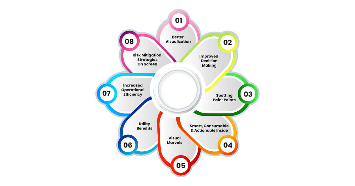
Executive dashboards are tools for immediate insights and visibility into particular areas of business. These dashboards help executives drill down to key information and root issues in a specific business activity. These are powerful tools for data visualization.
Below are the top benefits of executive dashboards:
Better Visualization
Like many others, your organization might be grappling with heaps of disorganized data. Visual dashboards offer a framework that structures and organizes the unstructured data for better visualization. Also, this can help promote a data-driven culture in organizations. Not only does it provide the required bird's eye view to explore business specifics at a granular level, but these dashboards also make it easy to understand due to their interactiveness and visual representation of data.
Improved decision-making
By providing a clear view of business performance and trends, executive dashboards enable more accurate and faster decision-making. Dashboards make it easier to identify key trends and set the groundwork for proactive decision-making. A study by the American Management Association has revealed that utilizing visual language can shorten your meetings by an astounding 24% owing to faster decision-making.
Spotting Pain-Points
An executive dashboard acts like a diagnostic tool for a business, much like a medical scan for a patient. Issues in businesses are easier to spot when displayed in KPIs format, trends, patterns, or charts. Deviating metrics, an unusual pattern, or a reversal in trend are data points. It's easier to spot the anomalies on dashboards due to visual representation.
Simple, Consumable, and Actionable Insights
Executives like marketers, SEO managers, HR managers, CFOs, and project managers are busy professionals. They won’t have time to read through hundreds of pages of reports and find insights in them. This is where executive dashboards come to their rescue. From breaking down thousands of data sets into core patterns to presenting the same on easy-to-read dashboards with vibrant colors, graphs, and vectors, executive dashboards are marvels of data storytelling.
Visual Marvels
Executive dashboards are visual marvels that are programmed to present information in aesthetically pleasing mode. From color contrasts to information hierarchy, the dashboards can present contextual info in an effortlessly comprehensible way. Critical and actionable data is typically placed front and center. This hierarchical structuring helps in quickly drawing attention to the most important insights.
Utility Benefits:
Dashboards provide real-time updates on project statuses, milestones achieved, and timelines, enabling executives to stay informed about the progress without delving into detailed reports. Business scorecards within dashboards offer a quick overview of multiple perspectives such as financial, customer, internal processes, etc.
Increased operational efficiency
The University of Bridgeport states that data analytics can eliminate operational inefficiencies. The executive dashboards present data analytics gathered from multiple touchpoints (customers, business locations, departments) on a central dashboard. With such information and analytics on screen, businesses can improve their operational efficiency by manifold.
Risk Mitigation Strategies on Screen
Dashboards can be configured to identify and monitor potential risks, such as market fluctuations, operational failures, or compliance issues. By providing early warning signs, dashboards allow executives to develop and implement risk mitigation strategies proactively.
Enhance the data analysis process with our expertise in creating engaging and custom executive dashboards that compile vast amounts of data.
Hire Dedicated Developers Hire Dedicated DevelopersMobile Friendly Executive Dashboards
Mobile-friendly executive dashboards have revolutionized business intelligence, providing dynamic, on-the-go decision-making tools crucial for the fast-paced business world. They offer real-time access to critical data, supporting prompt, informed decisions from any location. Live Data capabilities ensure executives are always informed of the latest updates.
Offering a dynamic, on-the-go decision-making tool, mobile-friendly dashboards provide executives with real-time access to critical data and reporting, allowing for immediate and informed decisions regardless of location.
The integration of features like 'Live Data' capabilities ensures that decision-makers are always equipped with the latest information, directly influencing operational efficiency and strategic direction.
How to Choose the Right Executive Dashboard Software for Your Purpose?
Choosing the right executive dashboard software is critical for the accuracy of data visualization. Flawless decision-making is highly dependent on error-free insights. Any false negatives on the dashboard can sway the executive decision in the wrong direction. Therefore, you must invest in the right executive dashboard to avail of the benefits of executive dashboards.
In the marketplace, several vendors will try to lure you by offering custom dashboard solutions, lucrative discounts, and extensive features. However, even a quarter of them may not stay true to their promises. Therefore, you must always think strategically, logically, and rationally before you invest in executive dashboard software solutions.
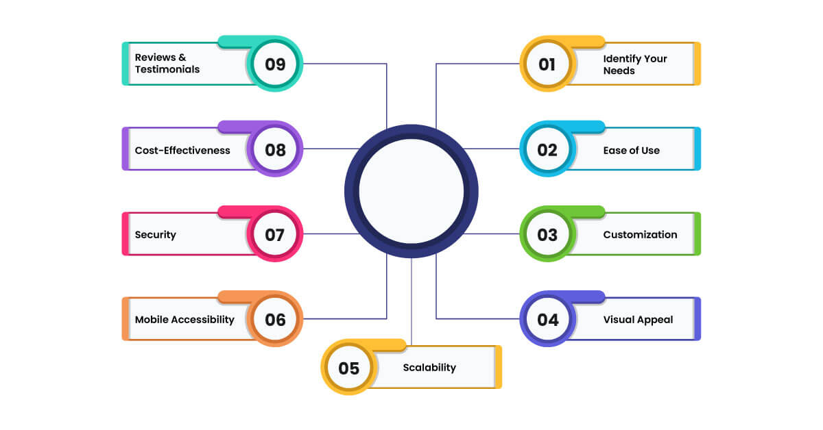
Follow the below steps/best practices to choose the most suitable executive dashboard solution for your needs:
Identify Your Needs: Understand what you want to achieve with the dashboard (e.g., real-time monitoring, historical data analysis, predictive insights).
Ease of Use: Look for software that is user-friendly and requires minimal training for you or your team.
Customization: Check if the dashboard allows for customization to match your specific reporting needs and preferences.
Visual Appeal: Opt for software that offers clear, appealing, and easy-to-interpret visualization options.
Scalability: Choose a solution that can handle data volumes and works without performance issues.
Mobile Accessibility: Ensure the dashboard is accessible on mobile devices for insights on the go.
Security: Confirm that it has robust security features to protect your sensitive data.
Cost-Effectiveness: Evaluate the pricing model to ensure it fits your budget and offers good value for the features provided.
Reviews and Testimonials: Research what other users are saying about the software to gauge its reliability and effectiveness.
Bottomline
Whether it's the granular analysis provided by a Sales Dashboard or the broad strategic employee oversight by an employee Dashboard, these tools combine narrative technique with visual data representation to ensure that complex information is made simple, consumable, and actionable. The mobile-friendly designs accommodate the modern executive's need for accessibility, making critical data available anywhere, anytime. Ultimately, executive dashboards are strategic assets that equip frontline managers to navigate their organizations toward success in a complex, data-driven environment.
If you are looking for data visualization services or want to uncover the power of business analytics with advanced executive dashboards, Xybte Enterprise Solutions can be your go-to destination.
Frequently Asked Questions
-
What is a KPI Dashboard in the context of
an Executive Dashboard?
A KPI Dashboard is a specialized analytics interface that focuses on Key Performance Indicators (KPIs) critical for executive decision-making. It distills complex data into performance metrics.
-
What kind of data can be integrated into
the Executive Dashboard?
An Executive Dashboard can integrate data types including financial metrics such as revenue, profit margins, and costs; sales indicators like lead conversion rates and customer acquisition costs; operational data covering efficiency, production rates, and inventory levels; human resources metrics like employee turnover, satisfaction, and productivity and many more. It depends on the type of executive dashboard and its custom metrics features.
-
Who Uses Executive Dashboards?
Executive Dashboards are primarily used by senior management, mid-level managers or team leaders, and department heads.

Bhavesh Parekh
Bhavesh Parekh is a Director of X-Byte Enterprise Solutions, an ever-emerging Top Web and Mobile App Development Company with a motto of turning clients into successful businesses. He believes that client's success is company's success and so that he always makes sure that X-Byte helps their client's business to reach to its true potential with the help of his best team with the standard development process he set up for the company.
Table Of Contents
- What is an Executive Dashboard and How Does it Work?
- Executive Dashboards Work by Combining Narrative Technique with Data Visualization
- Executive Dashboards For Frontline Managers
- Sales Dashboards
- HR Dashboard
- Operations Dashboard
- SEO Dashboards
- Financial Dashboard
- Business Analytics and Reporting Dashboards
- Project Management Dashboards
- SaaS Management Dashboard
- E-commerce Dashboard
- Real Estate Dashboard
- Healthcare Dashboard
- Safety Dashboards
- CRM Dashboards
- Logistics Dashboards
- Strategy dashboard
- Investor Relations Dashboard
- Quality Control Dashboards
- Maintenance Dashboards
- Benefits of Executive Dashboards
- Mobile Friendly Executive Dashboards
- How to Choose the Right Executive Dashboard Software for Your Purpose?
- Bottomline
- Frequently Asked Questions